In this Section we will learn how to create Bar chart in python with legends using matplotlib. This python Bar plot learning session also includes the steps to create Horizontal Bar plot, Vertical Bar plot, Stacked Bar plot and Grouped Bar plot.
Bar Chart in Python:
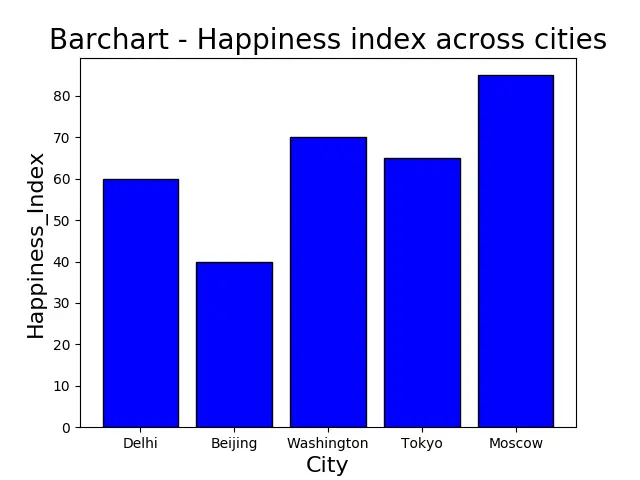
We will be plotting happiness index across cities with the help of Python Bar chart.
import matplotlib.pyplot as plt
import numpy as np

city=['Delhi','Beijing','Washington','Tokyo','Moscow']
pos = np.arange(len(city))
Happiness_Index=[60,40,70,65,85]

plt.bar(pos,Happiness_Index,color='blue',edgecolor='black')
plt.xticks(pos, city)
plt.xlabel('City', fontsize=16)
plt.ylabel('Happiness_Index', fontsize=16)
plt.title('Barchart - Happiness index across cities',fontsize=20)
plt.show()
- Line number 5, arange() function sets the x axis value.
- Line number 8, bar() function takes both the axis as input, sets color as blue and border color as black.
- Line number 9, xticks() function takes value as labels i.e. label of cities and happiness_index as input and plots the label
- Line number 10 to 13, plots x label, y label and title and shows the output.
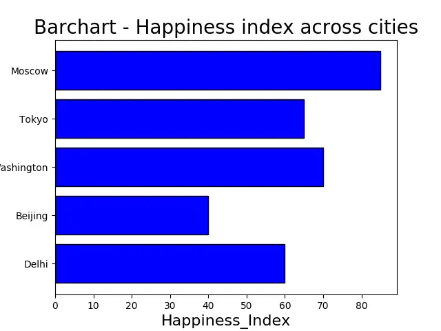
Horizontal Bar Chart in Python:
import matplotlib.pyplot as plt
import numpy as np


city=['Delhi','Beijing','Washington','Tokyo','Moscow']
pos = np.arange(len(city))
Happiness_Index=[60,40,70,65,85]


plt.barh(pos,Happiness_Index,color='blue',edgecolor='black')
plt.yticks(pos, city)
plt.xlabel('Happiness_Index', fontsize=16)
plt.ylabel('City', fontsize=16)
plt.title('Barchart - Happiness index across cities',fontsize=20)
plt.show()
- Line number 10, barh() function plots the horizontal bar chart which takes both the axis as input, sets color as blue and border color as black.
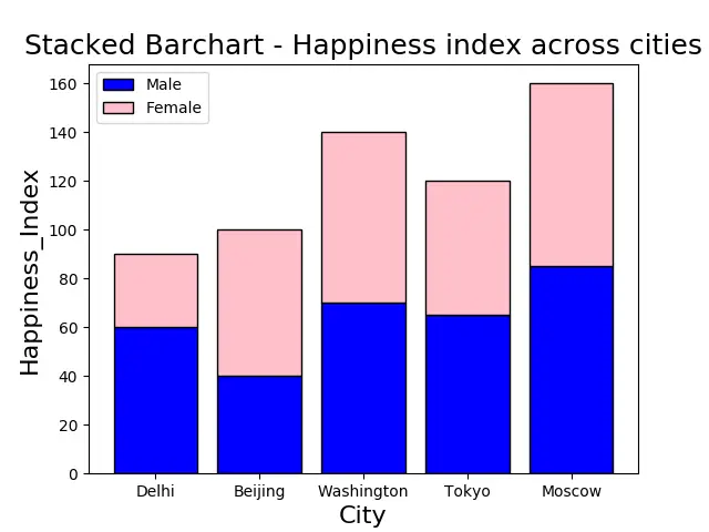
Stacked Bar Chart in Python with legends:
import matplotlib.pyplot as plt
import numpy as np

city=['Delhi','Beijing','Washington','Tokyo','Moscow']
Gender=['Male','Female']
pos = np.arange(len(city))
Happiness_Index_Male=[60,40,70,65,85]
Happiness_Index_Female=[30,60,70,55,75]

plt.bar(pos,Happiness_Index_Male,color='blue',edgecolor='black')
plt.bar(pos,Happiness_Index_Female,color='pink',edgecolor='black',bottom=Happiness_Index_Male)
plt.xticks(pos, city)
plt.xlabel('City', fontsize=16)
plt.ylabel('Happiness_Index', fontsize=16)
plt.title('Stacked Barchart - Happiness index across cities',fontsize=18)
plt.legend(Gender,loc=2)
plt.show()
- Line number 10, bar() functions plots the Happiness_Index_Male first.
- Line number 11, bar() function plots the Happiness_Index_Female on top of Happiness_Index_Male with the help of argument bottom=Happiness_Index_Male.
- Legend is plotted on the top left corner.
Which results in the python stacked bar chart with legend as shown below.
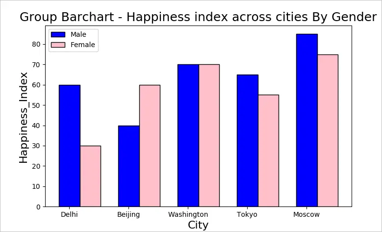
Grouped Bar Chart in Python with legends:
import matplotlib.pyplot as plt
import numpy as np

city=['Delhi','Beijing','Washington','Tokyo','Moscow']
Gender=['Male','Female']
pos = np.arange(len(city))
bar_width = 0.35
Happiness_Index_Male=[60,40,70,65,85]
Happiness_Index_Female=[30,60,70,55,75]

plt.bar(pos,Happiness_Index_Male,bar_width,color='blue',edgecolor='black')
plt.bar(pos+bar_width,Happiness_Index_Female,bar_width,color='pink',edgecolor='black')
plt.xticks(pos, city)
plt.xlabel('City', fontsize=16)
plt.ylabel('Happiness_Index', fontsize=16)
plt.title('Group Barchart - Happiness index across cities By Gender',fontsize=18)
plt.legend(Gender,loc=2)
plt.show()
- Line number 7, assigns bar width is fixed to 0.35.
- Line number 11, bar() functions plots the Happiness_Index_Male first.
- Line number 12, bar() function plots the Happiness_Index_Female side wise of Happiness_Index_Male through the first argument pos+bar_width.
- Legend is plotted on the top left corner.
Which results in the python grouped Bar chart as shown below
![]()
![]()
 Function in R")


 function")