In this Tutorial we will learn how to create Scatter plot in python with matplotlib. This python Scatter plot tutorial also includes the steps to create scatter plot by groups in which scatter plot is created for different groups.
Create Scatter plot in Python:
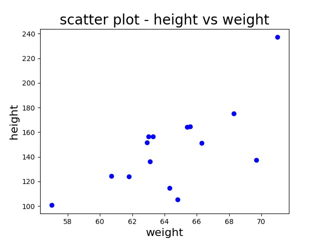
This example we will create scatter plot for weight vs height
import matplotlib.pyplot as plt

weight1=[63.3,57,64.3,63,71,61.8,62.9,65.6,64.8,63.1,68.3,69.7,65.4,66.3,60.7]
height1=[156.3,100.7,114.8,156.3,237.1,123.9,151.8,164.7,105.4,136.1,175.2,137.4,164.2,151,124.3]

plt.scatter(weight1,height1,c='b',marker='o')
plt.xlabel('weight', fontsize=16)
plt.ylabel('height', fontsize=16)
plt.title('scatter plot - height vs weight',fontsize=20)
plt.show()
Line 1: Imports the pyplot function of matplotlib library in the name of plt.
Line 3 and Line 4: Inputs the arrays to the variables named weight1 and height1.
Line 6: scatter function which takes takes x axis (weight1) as first argument, y axis (height1) as second argument, colour is chosen as blue in third argument and marker=’o’ denotes the type of plot, Which is dot in our case.
Line 7 and Line 8: x label and y label with desired font size is created.
Line 9 and Line 10: Mentions the Chart Title with font size and scatter plot is shown.
Different values for markers and their representation is shown below.
| Marker | meaning |
| . | point |
| , | pixel |
| o | circle |
| v | triangle_down |
| ^ | triangle_up |
| 8 | octagon |
| s | sqaure |
| p | pentagon |
| * | star |
| h | hexagon |
| + | plus |
| D | diamond |
Create Scatter plot by Groups in Python:
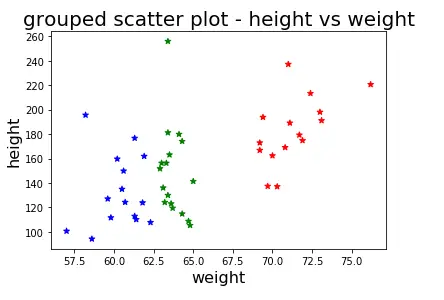
Example of scatter plot for three different groups
import matplotlib.pyplot as plt
import numpy as np

weight1=[57,58.2,58.6,59.6,59.8,60.2,60.5,60.6,60.7,61.3,61.3,61.4,61.8,61.9,62.3]
height1=[100.7,195.6,94.3,127.1,111.7,159.7,135,149.9,124.3,112.9,176.7,110.2,123.9,161.9,107.8]

weight2=[62.9,63,63.1,63.2,63.3,63.4,63.4,63.4,63.5,63.6,63.7,64.1,64.3,64.3,64.7,64.8,65]
height2=[151.8,156.3,136.1,124.2,156.3,130,181.2,255.9,163.1,123.1,119.5,179.9,114.8,174.1,108.8,105.4,141.4]


weight3=[69.2,69.2,69.4,69.7,70,70.3,70.8,71,71.1,71.7,71.9,72.4,73,73.1,76.2]
height3=[166.8,172.9,193.8,137.4,162.4,137.1,169.1,237.1,189.1,179.3,174.8,213.3,198,191.1,220.6]


weight=np.concatenate((weight1,weight2,weight3))
height=np.concatenate((height1,height2,height3))

color_array = ['b'] * 15 + ['g'] * 17 + ['r']*15

plt.scatter(weight, height, marker='*', c=color_array)

plt.xlabel('weight', fontsize=16)
plt.ylabel('height', fontsize=16)
plt.title('grouped scatter plot - height vs weight',fontsize=20)
plt.show()
- weight1, weight2 and weight3 is concatenated to form a weight array.
- height1, height2 and height3 is concatenated to form a height array.
- Corlor_array with first 15 blue color, second 15 green color and last 15 red color is created.
- All the above three arguments along with the marker=’*’ is passed to Scatter function.
Which results in plotting the scatter plot of 3 different groups with 3 different colors with ‘*’ being used as plot. So the resultant chart will be
![]()
![]()


