In this Tutorial we will learn how to plot Line chart in python using matplotlib. This python Line chart tutorial also includes the steps to create multiple line chart, Formatting the axis, using labels and legends. lets see with an example for each
Create simple Line chart in Python:
import matplotlib.pyplot as plt
values = [1, 5, 8, 9, 7, 11, 8, 12, 14, 9]
plt.plot(values)
plt.show()
Line 1: Imports the pyplot function of matplotlib library in the name of plt.
Line 2: Inputs the array to the variable named values
Line 3: Plots the line chart with values and choses the x axis range from 1 to 11.
Line 4: Displays the resultant line chart in python
So the output will be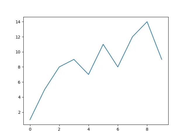
Multiple Line chart in Python with legends and Labels:
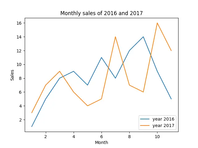
lets take an example of sale of units in 2016 and 2017 to demonstrate line chart in python.
import matplotlib.pyplot as plt
sales1 = [1, 5, 8, 9, 7, 11, 8, 12, 14, 9, 5]
sales2 = [3, 7, 9, 6, 4, 5, 14, 7, 6, 16, 12]
line_chart1 = plt.plot(range(1,12), sales1)
line_chart2 = plt.plot(range(1,12), sales2)
plt.title('Monthly sales of 2016 and 2017')
plt.xlabel('Sales')
plt.ylabel('Month')
plt.legend(['year 2016', 'year 2017'], loc=4)
plt.show()
Line 1: Imports the pyplot function of matplotlib library in the name of plt.
Line 2 and 3: Inputs the arrays to the variables named sales1 and sales2.
Line 4 and 5: Plots the line charts (line_chart1 and line_chart2) with sales1 and sales 2 and choses the x axis range from 1 to 12.
Line 6: Gets the title for the plot
Line7 and 8: Gets the label for x and y axis respectively
Line9: plots the legend for line_chart1 and line_chart2.
Line10: Displays the resultant multiple line chart
Line styles for python line chart:
Line styles:
| Character | Line Style |
| ‘‐’ | Solid line |
| ‘‐‐’ | Dashed line |
| ‘‐.’ | Dash‐dot line |
| ‘:’ | Dotted line |
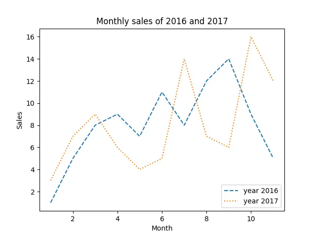
Example: Multiple line chart in python with different line style:
import matplotlib.pyplot as plt
sales1 = [1, 5, 8, 9, 7, 11, 8, 12, 14, 9, 5]
sales2 = [3, 7, 9, 6, 4, 5, 14, 7, 6, 16, 12]
line_chart1 = plt.plot(range(1,12), sales1,'--')
line_chart2 = plt.plot(range(1,12), sales2,':')
plt.title('Monthly sales of 2016 and 2017')
plt.xlabel('Sales')
plt.ylabel('Month')
plt.legend(['year 2016', 'year 2017'], loc=4)
plt.show()
The Line we chosen are dashed line and dotted line. So the resultant chart will be
Line colors:
| Character | Color |
| ‘b’ | Blue |
| ‘g’ | Green |
| ‘r’ | Red |
| ‘c’ | Cyan |
| ‘m’ | Magenta |
| ‘y’ | Yellow |
| ‘k’ | Black |
| ‘w’ | White |
Example: Multiple line chart in python with specified line color:
import matplotlib.pyplot as plt
sales1 = [1, 5, 8, 9, 7, 11, 8, 12, 14, 9, 5]
sales2 = [3, 7, 9, 6, 4, 5, 14, 7, 6, 16, 12]
line_chart1 = plt.plot(range(1,12), sales1,'g')
line_chart2 = plt.plot(range(1,12), sales2,'m')
plt.title('Monthly sales of 2016 and 2017')
plt.xlabel('Sales')
plt.ylabel('Month')
plt.legend(['year 2016', 'year 2017'], loc=4)
plt.show()
The color we chosen are Green and Magenta. So the resultant chart will be

![]()
![]()


